How to Set Up Mailer Box Artwork Files
By
••
10 min read
•Getting Started
A file that looks correct on screen can print wrong in ways that aren’t obvious until the box is in your hands.
Corrugated print has specific requirements that differ from standard digital or offset print. The black values are different. Resolution rules catch out designers who work mostly in vector. Font and transparency handling that is fine in other print formats causes problems here.
Most of these issues are invisible until a proof or a finished box reveals them. All of them are straightforward to avoid if the file is set up correctly before it goes to print.
Start With Size and the Right Dieline
Before any artwork is built, two things need to be confirmed: the box size and the dieline template for that size.
Size determines everything that follows — the dieline dimensions, how panels are laid out, and whether the product actually fits once the box is assembled. A file built on the wrong size dieline has to be rebuilt from scratch. Getting size confirmed before opening the design software removes the most avoidable rework in the process.
Six standard sizes are available, all measured as internal dimensions. If the product doesn’t fit cleanly within any of them, custom sizing is available from the same 150 unit minimum. How to choose the right mailer box size covers how to measure correctly and when custom makes more sense than standard.
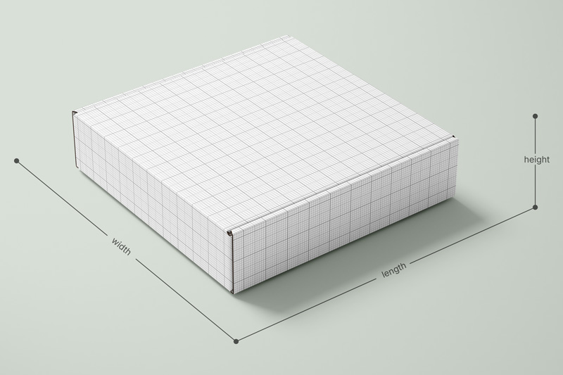
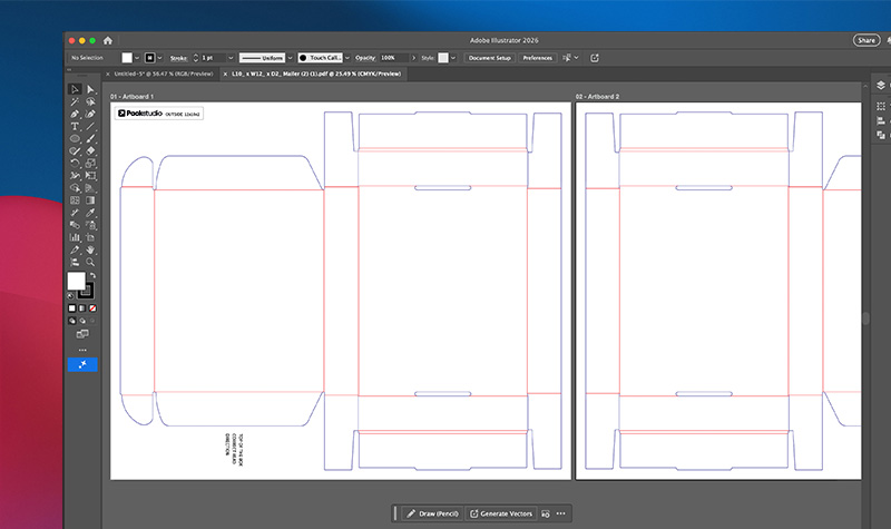
Once size is confirmed, the dieline template for that size needs to be downloaded before artwork is started. The dieline is the flat layout of the box — it shows every panel, fold line, and bleed boundary that the artwork needs to work within. Designing without it means placing artwork blind and correcting position at proof stage. Every size has its own template, available from the Specs and Templates section on the product page.
Open the dieline in a separate locked layer in Illustrator. Build all artwork on layers above it. The dieline itself should not be included in the final print file — it’s a guide, not a print element.
First Decision: Inside, Outside, or Both
Before the file is opened, one decision affects how the dieline is structured and what artwork needs to be prepared.
Mailer boxes can be printed on the outside only, the inside only, or both. Each option is full-colour CMYK — the difference is which surfaces the artwork covers and what the setup requires.
Outside only is the simpler setup and the lower-cost option. The exterior carries the brand. The customer opens a plain interior.
Inside and outside print costs more and requires artwork for both surfaces. The inside print is what the customer sees first — before they see the product, before they interact with anything inside the box. For brands where the unboxing experience is doing real work, inside print is where that experience is made or lost.
At early stage and low volume, inside print adds cost and file complexity before the return on that investment is clear. At scaling stage, when repeat customers and unboxing content are part of how the brand grows, it earns its place.
Decide which surfaces need artwork before building the file. It determines the dieline and how panels are laid out — changing it after artwork is done means reworking the layout.
If you haven’t confirmed which surfaces you’re printing, that decision sits on the mailer box page alongside the material spec.
Colour Mode and Black Values
Set the Document to CMYK
Every file going to print should be in CMYK colour mode, not RGB. RGB is the colour model screens use — it has a wider range than what ink on board can reproduce. Files built in RGB and converted at export often shift in colour, sometimes significantly. Build in CMYK from the start.
Black and Grey: Two Rules, Not One
This is where most files have errors — not from carelessness, but because the rules for corrugated print differ from what most designers default to.
Black text and linework: 0-0-0-100
Set all black text, outlines, and fine linework to a pure black value — 0% cyan, 0% magenta, 0% yellow, 100% black. No other ink.
The reason: commercial print registers four colour layers separately. Composite or “rich” black on fine text means those four layers each need to align precisely on a corrugated surface. Even slight misregistration — which is normal at this scale — produces blurry edges, fringing, or text that looks slightly out of focus. Pure black uses one ink layer. One layer can’t misregister with itself.
Grey tones: 0-0-0-20 (or your required percentage)
For grey areas, use black only with no cyan, magenta, or yellow. A value of 0-0-0-20 produces a clean mid-grey without colour cast. Adding other ink components to a grey value introduces unpredictable colour shifts on corrugated board, particularly on Kraft where the brown surface is already influencing the output.
Large black fills: 60-40-40-100
Pure black on a large solid area — a full-bleed black background, a wide black band — can produce banding. Banding is uneven ink coverage across the surface, showing as streaks or patches in what should be a consistent fill. Rich black (60% cyan, 40% magenta, 40% yellow, 100% black) distributes ink across all four channels and mitigates this.
The rule is not one or the other. It’s both, applied correctly:
- Text and fine detail → pure black (0-0-0-100)
- Large solid fills → rich black (60-40-40-100)
- Grey tones → black only, no other channels
Mixing these up is the most consistent source of print quality issues in mailer box files. Check every black value in the document before export.
If you’ve chosen Kraft as your finish, the brown base adds further complexity to colour output. The materials post covers how Kraft affects colour reproduction before the artwork stage.
Raster Images
Raster images — photographs, textures, product shots — are resolution-dependent. The resolution that looks fine on screen is often insufficient for print.
The requirement is 300 pixels per inch (ppi) at the final print dimensions.
Not 300ppi at the size the image is stored. 300ppi at the size it will actually print on the box. Placing a 72ppi image from a website into an Illustrator file and scaling it up to cover a box panel produces visible pixelation in print that cannot be corrected after the file is submitted. It is not a problem the printer can fix — it’s a file problem, and the result is a finished box with visibly degraded image quality.
Common raster file formats: .jpg, .png, .psd, .tif. PDFs can contain raster images — check resolution even if the file appears to be vector-based.
High-contrast raster images generally reproduce better on corrugated board than low-contrast or subtly detailed images. Fine photographic detail — hair, fabric texture, intricate product close-ups — can lose definition in the halftone print process used on corrugated. If photography is central to the design, Premium White is the more appropriate finish. On Kraft or Essential White, high-contrast images with strong edges hold up significantly better than soft or low-contrast photography.
Vector Files and Typography
Outline All Fonts
Before the file is exported, every font in the document must be converted to outlines.
Outlined fonts are no longer editable text — they become vector shapes. The printer’s system cannot substitute, reflow, or lose a font that doesn’t exist as a font anymore. Sending a file with live fonts means the printer’s system needs to have the exact same font installed. If it doesn’t, the text reflows — line breaks shift, text moves position, layouts break. This is discovered at proof stage at best, and after print at worst.
In Adobe Illustrator: Select All, then Type > Create Outlines. Save a version with live text for future edits before doing this — outlined fonts cannot be edited.
Embed All Images
Any linked image in the file — placed via File > Place in Illustrator — needs to be embedded before export. Linked files that aren’t embedded produce missing image errors when the file is opened on a different system. The printer sees a blank panel where the image should be.
Embed images via the Links panel in Illustrator, or ensure all images are embedded when exporting to PDF.
Flatten All Transparencies
Screens, overlays, soft light layers, multiply effects — anything running at less than 100% opacity needs to be flattened or converted to a solid CMYK colour value before the file goes to print.
Transparency effects are a normal part of design software. They are a known source of print output artefacts on corrugated. An overlay that looks intentional on screen can produce an unexpected edge, a colour shift, or a visible box around the effect in print. The fix is either to flatten the transparency to a single merged layer, or to convert the effect to an equivalent solid CMYK colour build at 100% opacity.
This applies to any screen, gradient overlay, or opacity setting below 100% — including elements that appear subtle or incidental.
Font Size and Weight
Minimum Size: 6pt
Text below 6pt risks becoming illegible in corrugated print. The board surface particularly Kraft, is slightly more absorbent than coated paper stock. Ink spreads marginally on contact. At small sizes, that spread fills in the gaps between letterforms.
6pt is the floor. For anything that needs to be clearly readable ingredients, instructions, legal copy, 8pt or above is safer.
Font Weight
Thin, light, and script fonts carry specific risks on corrugated. Fine strokes fill in. Hairline serifs lose definition. Script connections between letters can close up and become unreadable.
This doesn’t mean avoiding these fonts entirely. It means reviewing them at print scale — not screen scale — before committing. A font that looks elegant at 100% zoom on screen may not hold at the size it actually prints.
When using light-coloured or white text on a dark background, the risk increases. The optical contrast between a dark background and thin letterforms makes any ink spread more visible. Bold or thick-lettered fonts hold significantly better in these situations.
Before the File Goes to Print
Work through this before export:
- Document colour mode is CMYK
- Black text and linework is set to 0-0-0-100
- Large black fills are set to 60-40-40-100
- Grey tones use black only — no cyan, magenta, or yellow
- All raster images are 300ppi at final print dimensions
- All fonts are outlined
- All images are embedded
- All transparencies are flattened or converted to solid CMYK
- No text below 6pt — thin and script fonts reviewed at print scale
- Inside print panels checked for correct orientation against assembled box direction
- Bleed extended to the dieline edge — typically 3mm — so there are no white edges after cutting
Export as a high-quality PDF with bleed and crop marks included.
If the file is ready, it can be uploaded directly when configuring your box on the custom mailer product page.
Perfect artwork is easy when you know how.
If you’re unsure about any part of the file setup, our team can talk you through it before anything goes to print.

Ben Taylor
Product Manager, Packaging Studio
Ben Taylor is Product Manager at Packaging Studio, with 18 years’ experience across commercial print, packaging, and product setup. He understands the practical details behind successful packaging, from substrates and print processes to artwork preparation, design choices, and production requirements. His guides help businesses avoid common setup issues and make more informed packaging decisions before files go to print.