Understand the difference between mailer box materials.
By
••
7 min read
•Getting Started
Choosing a mailer box material means making two decisions, usually without realising there are two.
The card finish — Kraft, Essential White, or Premium White — determines how your design prints. The flute grade — E or B — determines how the box performs in transit. One affects your artwork. The other affects your shipping cost. Neither one fixes the other.
Card Finish: What You’re Actually Printing On
All mailer boxes are printed on corrugated board. The card finish is the outer surface — what your artwork goes on, and what a customer sees when the box arrives.
There are three options: Kraft, Essential White, and Premium White. They’re not just price tiers. Each one behaves differently in print, which affects what your design can actually do.
Finish should be confirmed before artwork is finalised. Change it afterwards and the file needs reworking.
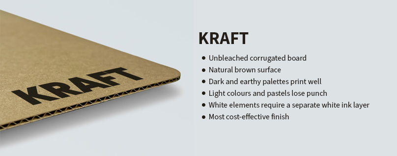
Kraft
Kraft is unbleached board. The surface is a natural mid-to-dark brown — not pale cream, not neutral. Every colour you print on it is sitting on top of that brown base, and the base shows through.
Most brands don’t factor this in. Blues shift slightly green. Yellows go mustardy. Anything light — pastels, muted tones, colours that rely on brightness — loses punch against the brown. Dark palettes, earthy tones, high-contrast designs tend to work well on Kraft. Bright, clean, or precisely matched colour palettes tend not to.
The thing that catches people out most often is white. Standard printing uses four inks — cyan, magenta, yellow, black. White isn’t one of them. On a white board, white elements in your design are just the surface showing through. On Kraft, there’s no white surface. Anything meant to appear white simply won’t print unless you specify a separate white ink layer, which costs more and needs to be sorted before the file goes to print — not after you’ve seen a proof.
If your design has white in it — a white logo, white text, white space used deliberately — Kraft needs a conversation before you commit. If your design runs entirely in dark or earthy tones with no white, Kraft is usually the most natural fit and the most cost-effective option.
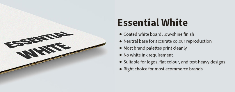
Essential White
Essential White is standard coated white board with a low-shine finish. It gives you a neutral base — colours print close to what you’d expect from a screen preview, light tones stay visible, and there are no white ink complications.
Most logos, flat colour work, text-heavy designs, and standard brand palettes print cleanly on Essential White without any additional setup.
It gets treated as the middle option — the thing you choose before you can afford Premium White. That’s not how it works. Essential White is the right call for most brands. Assuming it’s a stepping stone to something better is how brands end up spending more than they need to at early stages.
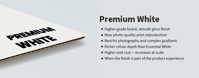
Premium White
Premium White is a higher-grade board with a smoother, glossier surface. The difference in print quality is real — finer detail, richer depth, closer to photo quality than standard coated board.
It earns its cost when print quality is genuinely central to the brief. Brands using photography, complex gradients, or detailed illustration at box scale will see a noticeable difference. Brands where the unboxing moment carries real weight in the customer experience may find the finish justifies the unit cost increase.
At low volumes the gap in price between Essential White and Premium White is manageable. At scale it adds up. The question worth asking isn’t whether Premium White looks better — it does — but whether that difference in finish matters enough to the customer to be worth the ongoing cost.
For most ecommerce brands it doesn’t. Essential White does the job.
When the Brief Pulls in Two Directions
The most common conflict: a brand with a natural, earthy aesthetic that suits Kraft, but a logo or key design element that uses white.
That’s not an automatic reason to move to white board. It’s worth exploring whether the design can be adapted — dropping the white element, shifting it to a light neutral that works against brown, or looking at a spot finish like foil as an alternative. Sometimes reworking the element improves the design. Sometimes the white ink cost is fine. Sometimes white board is just the right call.
What it shouldn’t be is a decision made at proof stage. Finding out white doesn’t print on Kraft after the artwork is approved adds delay and rework that’s easy to avoid.
If the finish decision still feels unclear — because the design isn’t finalised, or because the brief is genuinely caught between two options — our packaging specialists can work through it with you before anything is locked in.
Flute Grade: How the Box Performs in Transit
The flute is the corrugated layer inside the board — the wave structure between two flat sheets that gives the box its rigidity. Mailer boxes come in two grades: E Flute and B Flute.
From the outside they look similar. The difference is wall thickness, and wall thickness affects both protection and shipping cost.
E Flute has a thinner wall — around 1.5mm. It’s suited to lighter products, typically under 1kg, where the priority is presentation over structural protection. The thinner profile also means slightly lower dimensional weight, which can matter at shipping volume.
B Flute has a thicker wall — around 3mm. The extra material adds rigidity and resistance to compression, making it better suited to heavier products, typically 1kg and above, or anything fragile enough that the box needs to do more structural work. The additional thickness does add slightly to external dimensions.
Both grades ship without outer packaging — that’s the point of a corrugated mailer. But one is more suited to your product than the other, and that’s worth getting right before the order goes in.
If your product sits somewhere on the boundary — not obviously light, not obviously heavy — our packaging team can advise on which grade makes more sense before you commit.
What Getting Flute Wrong Actually Costs
E Flute on a product that needs more support risks box failure. The board compresses under weight or rough handling. At low volumes that might mean occasional damage. At scale it means returns, repackaging, and the cost that comes with both.
B Flute on a light product is a different problem. The box performs fine. The cost is in shipping. Carriers charge by dimensional weight when it exceeds actual weight — so a box that’s slightly larger than it needs to be costs more to ship every single time. Over volume, that adds up.
The flute decision isn’t just about protection. It has a direct effect on what you pay per shipment.
How to Choose
Finish first, flute second.
Card finish — based on your design and brand:
- Dark, earthy, or natural palette with no white elements → Kraft
- Design uses white as an active element → Essential White or Premium White
- Colour accuracy matters across the palette → Essential White or Premium White
- Photography, complex gradients, or detailed illustration in the design → Premium White
- Budget is a constraint and the aesthetic allows → Kraft
- Brief says premium but the unit cost doesn’t stack up at your volume → Essential White
Flute grade — based on your product:
- Lightweight product under 1kg, presentation-led → E Flute
- Heavier product 1kg and above, or fragile → B Flute
- Unsure → B Flute; it covers more ground without structural risk
Before Artwork Is Finalised
Finish affects how the file needs to be set up. Artwork built for white board doesn’t transfer cleanly to Kraft — colours shift, white elements disappear, and contrast reads differently against the brown base. Sorting this before the file is done saves a round of corrections.
Flute affects external dimensions. If the box needs to fit a specific space — a shelf, a storage unit, a secondary shipper — confirm flute grade before specifying size.
The order that avoids most delays: finish and flute confirmed first, artwork and dimensions built around those. It’s a small thing that removes the most common friction between brief and first proof.
If you’ve landed on a combination, you can configure your mailer box directly on the Custom mailer box configurator page.
The right material decisions start before the artwork does.
If you’re still working through finish and flute, our packaging team can help confirm the right specification before anything is locked in.

Ben Taylor
Product Manager, Packaging Studio
Ben Taylor is Product Manager at Packaging Studio, with 18 years’ experience across commercial print, packaging, and product setup. He understands the practical details behind successful packaging, from substrates and print processes to artwork preparation, design choices, and production requirements. His guides help businesses avoid common setup issues and make more informed packaging decisions before files go to print.