How to Set Up Product Box Artwork Files
By
••
10 min read
•Getting Started
A product box file has more layers than most designers expect going in.
Standard CMYK artwork covers the print. If Spot UV or foil embellishment is part of the spec, each one needs its own separate layer set up correctly in the file before anything goes to print. Get the layer structure wrong and the Spot UV prints in the wrong place, the foil doesn’t register, or both — and the problem only shows up when the finished box is in your hands.
Confirm the full spec before the file is opened — print sides, Spot UV, foil — then build the file around that.
Start With Size and the Dieline
Before artwork is built, two things need to be confirmed: the box size and the dieline template for that size.
Size determines everything that follows — the dieline dimensions, how panels are laid out, and whether the product fits once the box is assembled. A file built on the wrong size dieline has to be rebuilt from scratch.
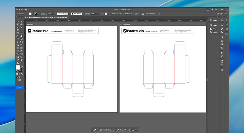
Once size is confirmed, download the dieline template from the Specs and Templates section on the product page. Open it in a separate locked layer in Illustrator. Build all artwork on layers above it. The dieline itself should not be included in the final print file — it’s a reference, not a print element.
If size hasn’t been confirmed yet, how to choose the right product box size covers how to measure and which standard size suits which product.
Printed Sides: Outside, Inside, or Both
Before the file is structured, confirm which surfaces need artwork.
Outside only is the simpler setup — the exterior carries the brand, the interior is unprinted. Lower cost, less file complexity.
Inside only is rarely the right call on its own.
Both sides requires artwork for all surfaces. For retail product boxes the inside print is seen at the moment the customer opens the box for the first time — at point of use, not unboxing. It’s a quieter moment than a mailer box interior but still a deliberate brand touchpoint for brands where that detail matters.
When printing both sides, panel orientation matters. The inside panels of a product box run in the opposite direction to the outside when the dieline is flat — what reads correctly on the outside will be upside down on the inside if the artwork is placed without accounting for this. Check inside panel orientation against the assembled box direction before the file is finalised. The dieline template shows which panels are which.
Decide which surfaces need artwork before building the file. Changing this decision after artwork is built means reworking the dieline layout.
Colour Mode
All files must be set to CMYK colour mode before export.
RGB is the colour model screens use. It has a wider gamut than what ink on card can reproduce. Files built in RGB and converted at export shift in colour — sometimes subtly, sometimes significantly. Build in CMYK from the start.
Black and Grey Values
The same rules apply here as for corrugated print — and for the same reasons.
Black text and linework: 0-0-0-100
Pure black only — 0% cyan, 0% magenta, 0% yellow, 100% black. No other ink channels.
Standard printing registers four colour layers separately. Composite black on fine text means all four layers need to align precisely. Even slight misregistration produces blurry edges or fringing on text that should be sharp. Pure black uses one ink layer. One layer can’t misregister with itself.
Large black fills: 60-40-40-100
Rich black on large solid areas prevents banding — uneven ink coverage that shows as streaks across a wide fill. The rich black value distributes ink across all four channels and produces more even coverage.
Grey tones: 0-0-0-20 (or required percentage)
Black only for grey. No cyan, magenta, or yellow. Adding other ink components introduces colour cast that is unpredictable on coated card.
The rule across all three: pure black for fine detail, rich black for large fills, black only for grey. Check every black value in the document before export.
How do I set up a Spot UV or foil layer for a product box?
Create a new Spot colour swatch in Illustrator’s Swatches panel, set it to white, name it “Spot UV” or “Foil” respectively, and apply it to the areas that will receive the effect. Each effect needs its own named layer sitting above the CMYK artwork. Spot UV and foil areas should not overlap.
Spot UV and Foil Layer Setup
Spot UV applies a selective gloss coating over specific areas of the print — a logo, a pattern, a border — while the rest of the surface stays flat. Gold or silver foil adds a metallic element that print alone can’t achieve. Both work the same way in terms of file setup: a separate named spot colour layer defines exactly where each effect is applied.
Setting Up Either Layer in Adobe Illustrator
The process is identical for both Spot UV and foil:
- Open your document
- Select the object or area that will receive the effect
- Open the Swatches panel — Window > Swatches
- Click the Swatch Options menu icon at the top right of the panel
- Choose New Swatch from the dropdown
- Set Color Type to Spot
- Set the colour to White
- Name the swatch — use “Spot UV” for the gloss layer, “Foil” for gold foil, “Silver Foil” for silver
- Click OK
- Apply the swatch to the selected object or area
The Differences Between the Two
Spot UV: The layer defines where gloss sits over the print. It sits above the CMYK artwork layer. Wherever the Spot UV colour is applied is where the gloss lands on the finished box.
Foil: The layer defines where metallic foil is applied. It also sits above the CMYK artwork layer. If both Spot UV and foil are used on the same box, each needs its own named spot colour layer — they must not share a layer, and their areas must not overlap.
The foil and Spot UV areas should not overlap. Where foil is applied, Spot UV is not needed. If the two layers overlap, the effects will conflict in production. Design them to sit in separate areas of the artwork.
Check layer order before export: CMYK artwork at the base, Spot UV and foil layers above, each correctly named.
Raster Images
Raster images — photography, textures, product shots — must be 300 pixels per inch at the final print dimensions.
Not 300ppi at the size the image is stored. 300ppi at the size it will actually print on the box. A 72ppi image scaled up in Illustrator to cover a panel produces visible pixelation at print that cannot be corrected after the file is submitted.
Common raster formats: .jpg, .png, .psd, .tif. PDFs can contain raster images — check resolution even if the file appears to be vector-based.
High-contrast images reproduce better on coated card than soft, low-contrast photography. Fine photographic detail — subtle gradients, soft shadows, delicate texture — can lose definition in the halftone print process. Where photography is central to the design, high-contrast images with strong edges give more reliable results.
Fonts and Typography
Outline All Fonts
Every font in the document must be converted to outlines before export.
Outlined fonts become vector shapes — the printer’s system cannot reflow, substitute, or lose them. A file with live fonts requires the printer to have the exact same font installed. If it doesn’t, text shifts position, line breaks change, layouts break.
In Adobe Illustrator: Select All, then Type > Create Outlines. Or Ctrl + Shift + O on Windows, Cmd + Shift + O on Mac.
Save a version with live text before outlining. Outlined fonts cannot be edited.
Minimum Font Size
Text below 6pt risks becoming illegible on coated card. Ink spreads marginally on contact with the surface. At small sizes that spread fills in the gaps between letterforms.
6pt is the minimum. For anything that needs to be clearly readable — ingredients, legal copy, instructions — 8pt or above is safer. 10pt or above for anything that needs to be easily read at a glance.
Font Weight
Thin, light, and script fonts lose definition in print. Fine strokes fill in. Hairline connections in script fonts can close up and become unreadable.
When using light-coloured or white text on a dark background, the risk increases. Bold or thick-lettered fonts hold significantly better in these situations — the optical contrast between a dark background and thin letterforms makes any ink spread more visible.
Review thin and script fonts at actual print scale before finalising.
Embed Images and Flatten Transparencies
Any linked image placed in the file via File > Place must be embedded before export. Linked files that aren’t embedded produce missing image errors when the file is opened elsewhere. The printer sees a blank panel.
Embed via the Links panel in Illustrator, or ensure all images are embedded in the PDF export settings.
Transparencies — screens, overlays, multiply effects, anything running below 100% opacity — must be flattened or converted to a solid CMYK colour value. Transparency effects are a known source of print artefacts. An overlay that looks intentional on screen can produce an unexpected edge or colour shift in print.
Bleed
All artwork must include 3mm (0.125 inches) of bleed on every edge.
Bleed is the area of artwork that extends beyond the final trim line. When the box is cut, the trim never falls in exactly the same place twice. Without bleed, that small variation produces a white edge at the border of the finished box.
Extend all background colours and design elements that touch the edge of the document 3mm beyond the trim line. Elements that sit away from the edge — centred logos, interior text — don’t need to extend into the bleed area, but should sit at least 3mm inside the trim line.
To set up bleed in Adobe Illustrator: File > Document Setup > enter 3mm in the Bleed input fields > OK.
Before the File Goes to Print
Work through this before export:
- Document colour mode set to CMYK
- Black text and linework set to 0-0-0-100
- Large black fills set to 60-40-40-100
- Grey tones use black only — no cyan, magenta, or yellow
- All raster images at 300ppi at final print dimensions
- All fonts outlined
- All images embedded
- All transparencies flattened or converted to solid CMYK
- No text below 6pt — thin and script fonts reviewed at print scale
- Spot UV layer set up as a named spot colour — correctly named, sitting above CMYK artwork
- Foil layer set up as a separate named spot colour — correctly named, not overlapping with Spot UV
- 3mm bleed applied on all edges — background colours and edge elements extended into bleed area
- Inside print panels checked for correct orientation if printing both sides
- Dieline not included in the export file
Export as a high-quality PDF with bleed and crop marks included.
If the file is ready, it can be uploaded when configuring your box on the product box page.
Perfect artwork is easy when you know how.
If you’re unsure about any part of the file setup, our team can talk you through it before anything goes to print.

Ben Taylor
Product Manager, Packaging Studio
Ben Taylor is Product Manager at Packaging Studio, with 18 years’ experience across commercial print, packaging, and product setup. He understands the practical details behind successful packaging, from substrates and print processes to artwork preparation, design choices, and production requirements. His guides help businesses avoid common setup issues and make more informed packaging decisions before files go to print.